
Product Page Optimization: 7 Tips Even Tech-Savvy Business Owners May Not Know
Product pages are the heart and soul of your eCommerce store whether it’s a dropshipping or print-on-demand business. Product page optimization means that every element related to a particular product be presented at its best to help your store get found via search engines, and ultimately convert browsers into buyers.
Menu:
Why Does Your Product Page Need Optimization?
Everything you do is to convince your visitors to land on your product pages – hopefully, with an intention to buy. That’s why many store owners spend a bunch of money on Facebook Ads and Google Ads to draw potential buyer’s attention.
But there’s one massive problem: The visitor only gives the store a few seconds of browsing and bounces away without coming back later. As of Q3 2020, the average conversion rate of eCommerce site visits is only 2.17% – that probably means thousands of dollars in advertising but just a fraction of revenue returned.
That is when product page optimization comes in. Of course, tips may already be all over the place, but one thing for certain is that they all take blood, sweat, and tears to be mastered.
To help you save your time and money in the search for the best product page optimization strategies, we’ve gathered the 7 most effective ones in this article.
You will find the complete guide delivered with examples to:
Producing high-converting pictures and videos
Writing product descriptions at the next level
Triggering customer’s urgency/scarcity instinct
Maximizing sales using Upsell & Cross-sell strategies
Boosting CR by adapting a single change to CTAs button
Building brand trust to promote product’s authenticity
Improving mobile performance with a few easy steps
It can be exaggerated to say these will help to skyrocket your sales overnight, especially when we’re in the rising competitiveness of the eCommerce world. But they’re definitely worth checking out.
The 7 Tips for a Killer Product Page
Use Professional Product Images and Videos
When it comes to online shopping, people do judge the book by its cover. This happens because customers can’t usually see, touch, taste, or try your products IRL before they buy. No surprise when 93% of customers considered visual presentation as the key factor in a purchasing decision.
If you can’t make your product images and videos stand out from the crowd, you may end up losing a whole line of potential customers right at first sight.
- Images
As mentioned above, unlike in brick-and-mortar stores, your customers can’t see, touch, feel, or try your products when they buy online. That’s why you should show your product from multiple angles to help your customers visualize it. In fact, 33.16% of customers prefer to see multiple photos of a product before they make a purchase.
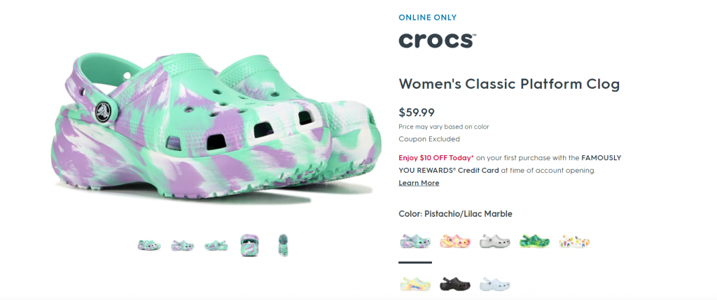
Make sure to capture many angles and highlight the important parts of your product like these from Famous Footwear
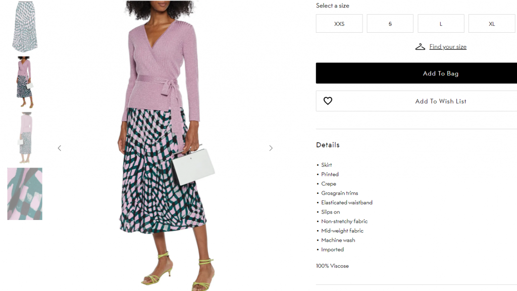
You should also include a few in-context or lifestyle images of your product. Look at the two product images below from Madewell and compare.
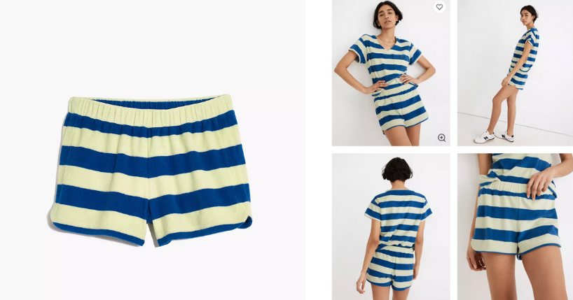
The blue stripe shorts on the left are laid on a plain white background.
However, the fact that no model is wearing it leaves many unanswered questions about the fit.
Are they tight-fitting shorts? Will they end too high from the knees? What kind of shoes are better paired with this?
All of these questions are answered by the photo on the right, where you can see how the short fits on the model’s body. For the record, Madewell does use all of these pictures to optimize their product page.
- Videos
Videos let customers take a trial run of your products and see them in action. From SaaA companies filming tutorials to show off their features to fashion retailers filming a model walking around to show how a garment flows.
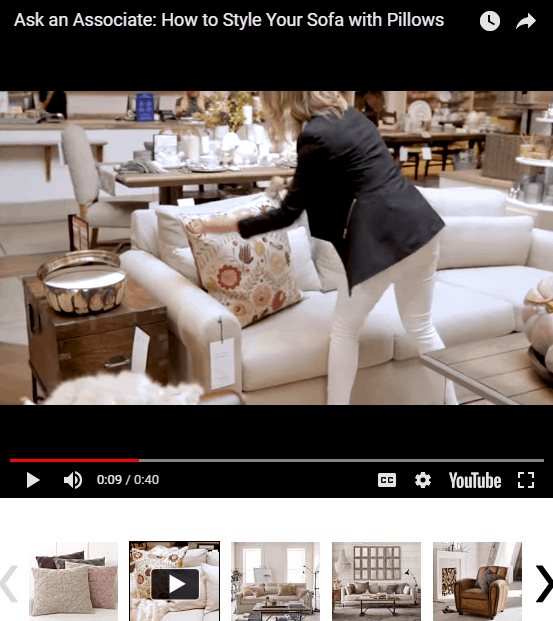
A home furnishing store, Pottery Barn, uses a variety of images to show off its products. Sometimes, they also include in-context videos that feature their product, just like this one for their embroidered pillow covers.
Another example is VAT19 selling a product called “Hot Sauce Challenge 12-Pack”. Here’s the product page:
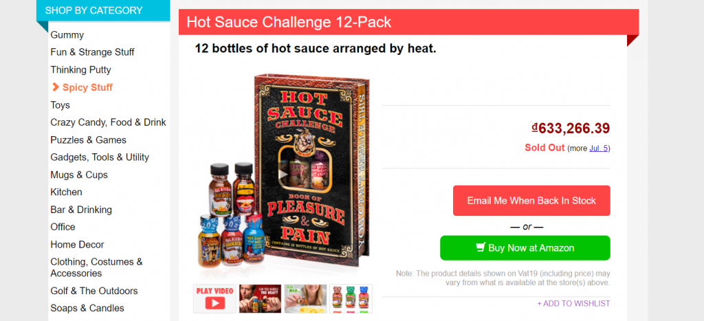
As you can see, you can hit the “play video” button or simply click the play button on the main product image. When you click the video CTA, this player appears:

With this, people can see exactly what they’re purchasing. Sometimes, a picture is enough, but sometimes a video is helpful as well.
Write Compelling Product Description
A product description is a piece of content that tells about the product’s specific features and benefits. It used to be seen as a minor part that has little to do with website conversion optimization.
But given the intensity of competition in today’s frantic business world, such details matter more than you think.
A well-written product description can help your potential buyer decide whether his/her investment’s worth it; It does wonders for SEO; It also enhances the bond between your brand and customers by, for example, telling a story.
So, what does it take to write something that actually attracts customers? It’s all based on the fundamental implication that you know your audience. Of course, certain principles will inject a bit more power into your prose, like:
- Accentuating the product’s benefits
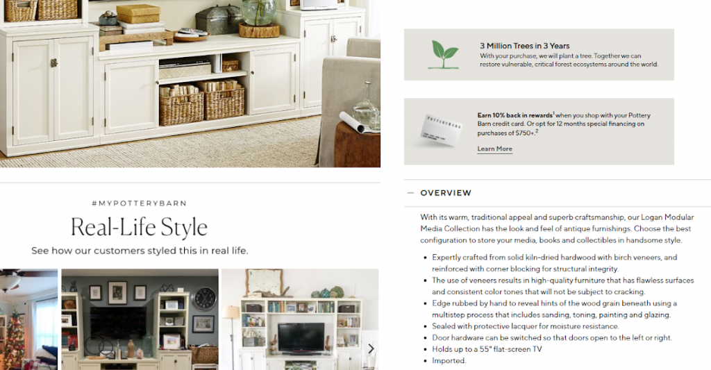
Pottery Barn emphasize its statement on planting a tree each time a purchase is made right above the product’s main features
- Writing clearly and concisely
The Outnet loves getting straight to the point in describing each of its products
- Telling compelling stories

Holstee creates a beautiful story for their print arts using a concept called “New Possibilities”
- Addressing questions and uncertainties
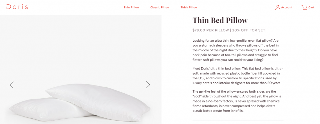
Doris Sleep showing how careful they are for their customers’ good night sleep
To be more specific, check out this blog to have ideas on making the most out of your product description.
Leverage Psychology Tricks
Urgency is the most common psychological trigger used by many eCommerce websites to speed up a user’s purchasing decision. Scientifically speaking, urgency is a concept that prompts us to act quickly. Much of the efficacy of urgency is rooted in loss aversion, assuming that people seem to be more motivated by the thought of losing something than by the thought of gaining something of equal value.
There are two broad types of urgency: time-based and quantity-based.
When faced with a limited-time offer, we start to automatically evaluate if we’re comfortable letting this opportunity split away. If the shop were to offer free shipping for 24 hours, shoppers might forget. But a 2-hour time limit creates focus. Some limited-time offers include:
- Free Delivery: Generally, a few days to a week is a good time frame for maximum benefit. You should include specific limits, for example, “free shipping until 15 March” instead of “free shipping for a limited time”. You can try to set a minimum threshold for free shipping to be valid, as most customers will purchase extra items to reach the level required.
- Promotion Code/Coupon that will be Expired
- Free Gift for the First X customers
Quantity-based urgency tactics are even easier to implement, as you’ll naturally have a limit on your inventory. You lose out on a sale with limited time or a gift, but the product is still there if you decide you want it later. With limited quantity, it may be gone forever when stock runs out. Making customers aware that there is limited stock left of a product makes them believe that your product is highly valued.
The easiest thing you can do on the product page is using Social Proof, a psychological phenomenon that people assume following others would be the right choice.
On ShopBase, we do some crazy hacks for your performance within the Boost Convert app, such as:
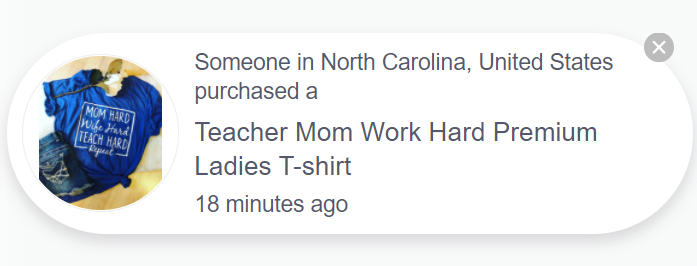
- Real-time Updates, social proof by other visitors: This feature helps highlighting the right or best-selling products. We offer three types of notifications that display other customers’ purchases so that new customers find your site trustworthy and trusted.
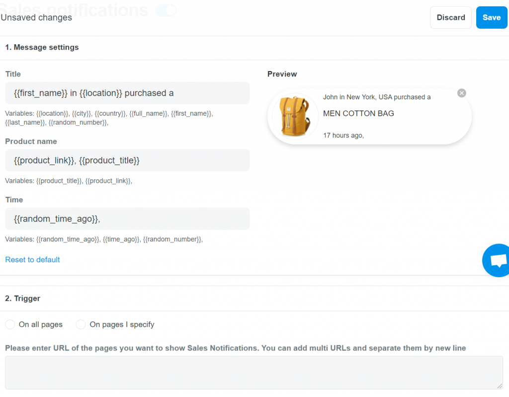
A sale notification is the notice of actual customer purchases on the page
Custom notification is the notice of orders that are automatically created based on location data and the product you entered
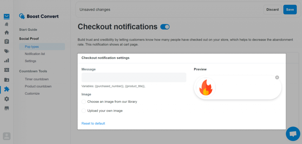
Checkout notification shows how many customers have completed the payment in the last 24 hours
- Countdown Tools: It is used to motivate customers to purchase before products run out of stock or promotions expire, by adding product countdown & timer countdown. You can also customize these features’ color, font, or font size.
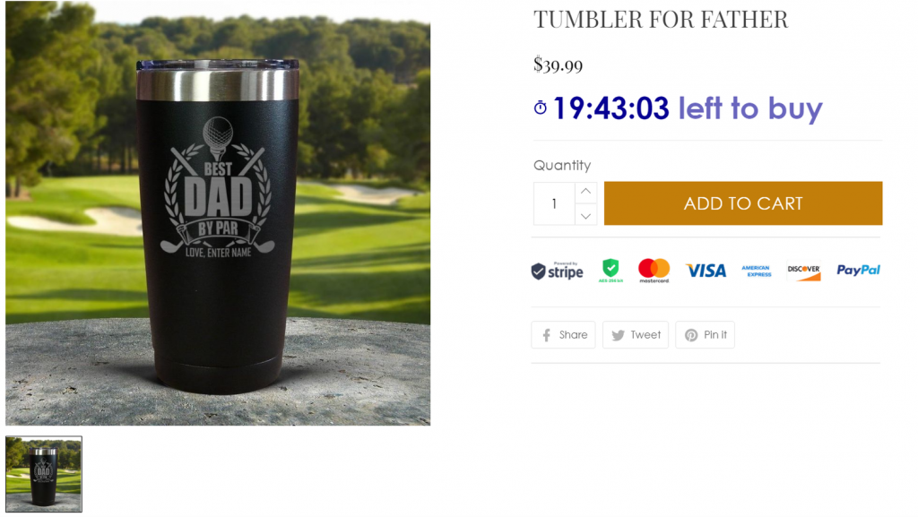
Countdown timers can be set for all product pages or different products
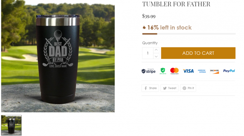
Product countdown shows the number of products remaining
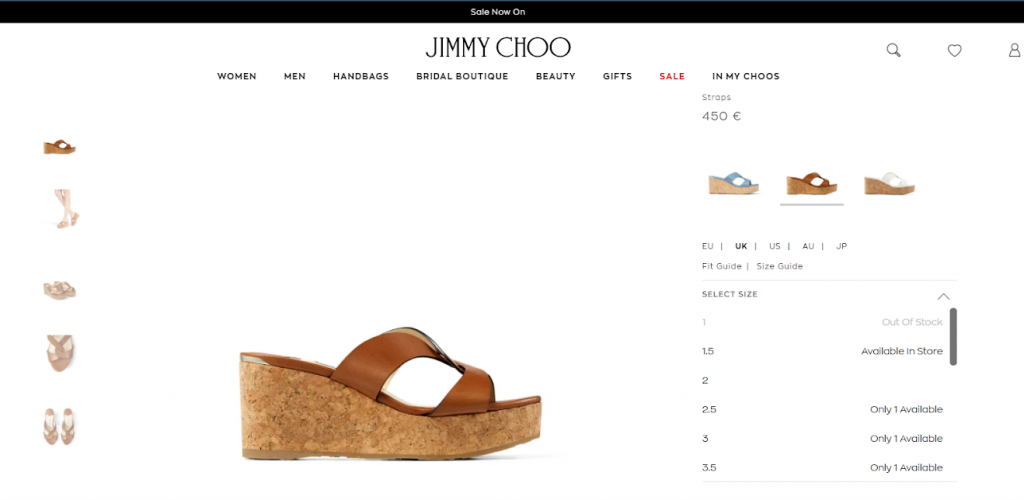
High-end shoe brand Jimmy Choo displays the number of items left in stock – including when products are out of stock – after customers select their size
Build a fully-featured store with ShopBase here
Adopt Up-sell & Cross-sell Techniques
Though an eCommerce product page should focus on selling its winning product, you shouldn’t miss the chance to promote other products.
You can recommend relevant products or other similar products to your shoppers when they’re on a product page. This can help you engage and encourage them to make more purchases. It can also help your prospects with their shopping needs or even increase time-on-site if you can strategically draw their attention from collection to collection.
That’s why many eCommerce brands use Upselling and Cross-selling techniques to maximize average order size and revenue so that it improves the overall CR.
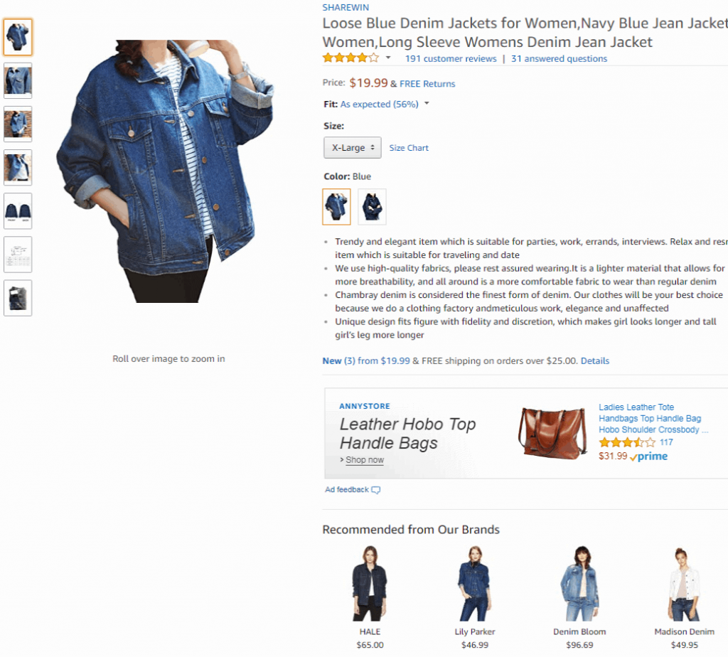
Amazon displays relevant products from the same brand and other similar products on their eCommerce product page. They also showcase products that are frequently brought together to help customers buy everything they need at once.
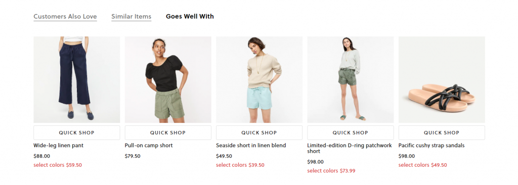
When a customer is on J.Crew looking for a crewneck sweatshirt, for example, they will suggest relevant products such as shorts or a pair of sandals.
Sometimes, personalized recommendations based on the products they viewed or bought recently can also improve conversions.
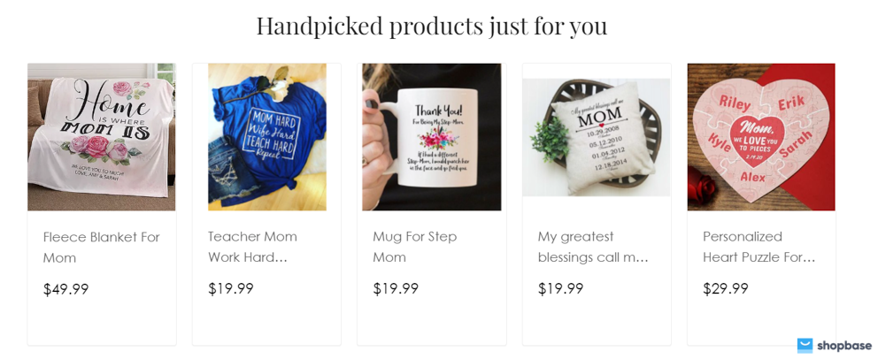
With ShopBase, you can install the Boost Upsell app for free and create Upsell and Cross-sell, which can help you increase your AOV by several times.
We offer Product Widget acting as a free marketing tool for the store, helping to keep customers longer on the website. From there, you have the opportunity to advertise and showcase other products at no extra cost.
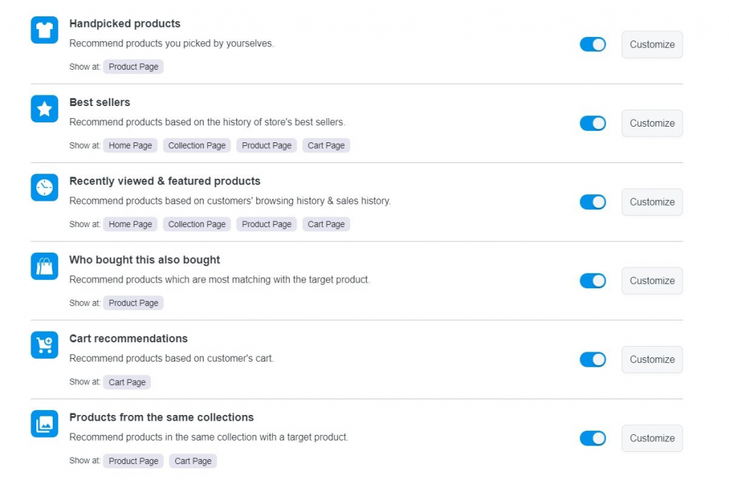
Some of the features that you can use to build your campaign in ShopBase’s Product Widget
Revenue from Boost Upsell accounts for around 10% of the total revenue of each store on ShopBase
Try ShopBase Upselling and Cross-selling techniques for free
Highlight the CTAs button
Every online business uses CTAs, from the household name brands and platforms you interact with daily to startups you’ve never heard of. For instance, on Facebook, most of the ads you see have a CTA to download more or read more.
CTAs are the buttons throughout a site that tell your customers what to do, where to click, and what to buy. It’s important to remember that making a CTA standout is about finding the best mix of three essential elements – color, language, and placement.
- Colors
In terms of color, generally speaking, blue, red, green, and orange work best. But best practices can vary significantly from site to site.
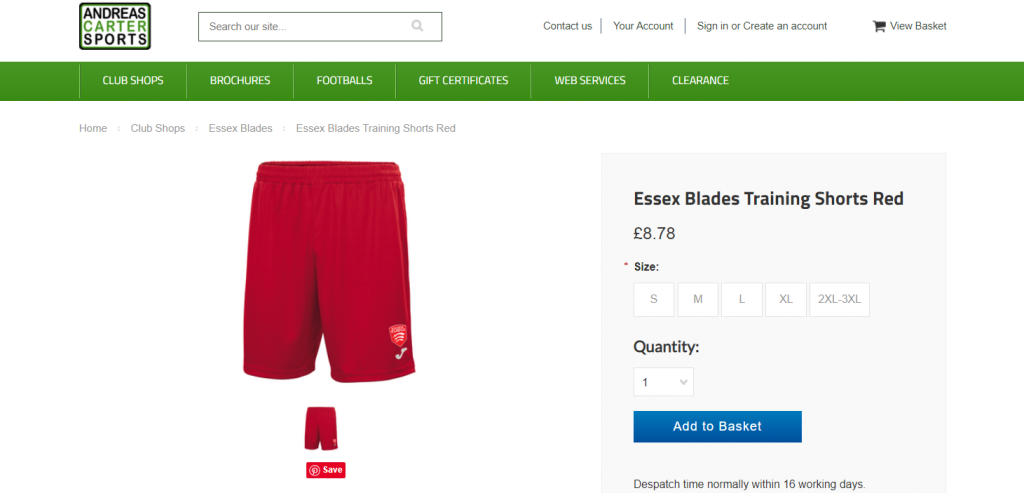
“One of the biggest changes we made was to the “Add To Basket” button. Simply changing it from black to a blue color has reduced abandoned carts by up to 50%.”, said Jeremy Hagon, Marketing Manager, Andreas Carter Sports.
Button shape can also play a big role when attempting to craft the perfect CTA button. You’ll need to consider whether you want to go with a more rounded button shape or a button with square edges. Hard to say what works better here as both styles are common and both can perform well in different settings.
Testing is the key here. It’s easy to run A/B split-tests and evaluate multiple colors, shapes, and sizes.
- Languages
Certain phrases have been shown to drive more clicks. The best phrases for your pages will be unique to your brand and site, but by focusing on a handful of proven examples, you can much more effectively hone in on the winners. Here are some of the best phrases to use:
-
- Learn More: A “soft” phrase that doesn’t ask for commitment and can be used to advertise offers, discounts, sales, etc.
- Join Free: The word “free” is always a sure bet. Use it for CTAs that lead visitors to join a loyalty program.
- Buy Now (With One Click): The phrase “Buy Now” is simple and to the point. You can also provide a one-click option like Amazon to make the purchase process appear even more frictionless.
- Add to Cart: The reason that “Add to Cart” is so popular is that it works. Customers recognize this CTA instantly and you’re leveraging an automatic behavior by using it on your product pages.
- Placement
Optimizing a product page is all about making the buying process as simple and seamless as possible. Visitors shouldn’t have to struggle to find the information they need to make a decision.
Clustering the most essential details about a product in one spot, next to the main CTA, is one of the most effective ways of achieving this frictionless customer journey.
Include the following information alongside, or in very close proximity to, your main CTA on product pages: price (including any discounts), availability, delivery policy, aggregate reviews, color, size, and quantity options.
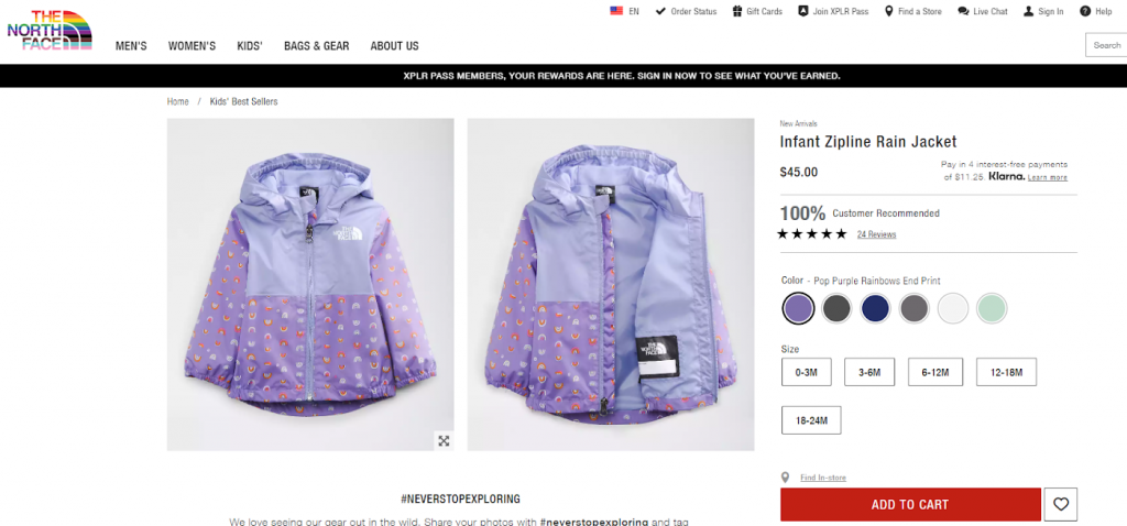
North Face shows all essential information in close vicinity to the main CTA on product pages
You shouldn’t implement changes blindly, of course. Relying on the results of a few hundred visitors is a bad idea. But industry standards are no substitute for your own data based on properly formulated sample sizes.
Build Brand Trust
Long-term conversion rate isn’t a special orange button, it’s building value through knowledge and trust. Besides the quality of the product, customers also want to know what your company is like, how your customer service team behaves, and how reliable your shipping methods are. There’s nothing worse than ordering an item that arrives broken – three weeks late.
Here are some well-established ways to build trust on a product page:
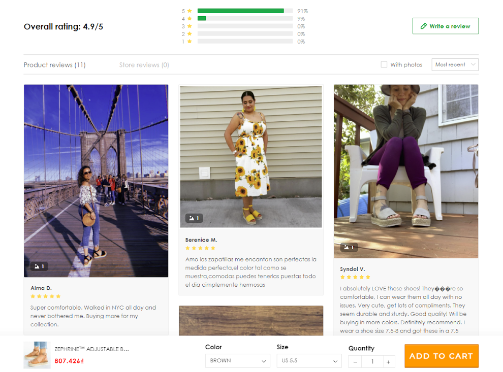
- Add Comparative Elements to Reviews
Even the best photos won’t paint a complete picture of your products to the audience. On the fashion side, customers tend to be skeptical of models who look good in everything and might be photoshopped.
In the tech industry, the size and shape of an item rarely matter as much as the performance. This is where customer reviews come in. Basically, they are the content generated by other users that help simplify and validate your customers’ decisions.
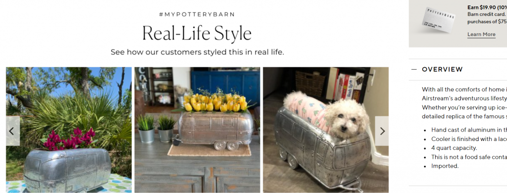
Reviews section at Pottery Barn’s website
SHEIN is one of the best examples of pulling customer reviews and offering comparisons to shoppers. You can also provide incentives (like points for discounts) for customers to share their photos and upload their information on them.
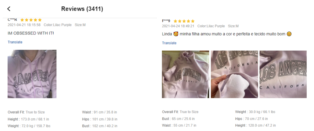
Here, not only can you see how this photo looks on a non-model human being, but you can also get her measurements and compare them to yours. From this review, in particular, you can see that even if you order the wrong size, it still looks good.
Small takeaways when you want to ask for a review:
-
- Always ask for customer feedback and offer gifts/rewards in return;
- Regularly remind loyal customers to leave reviews;
- Add review links to thank you pages or order confirmation emails;
A store on ShopBase shows its positive reviews which can enhance other buyers’ trust
ShopBase has an app called Product Review that helps sellers to display reviews on the product page or All reviews page. With this, you can effortlessly customize your product reviews section:
-
- Import reviews from CSV files or via AliExpress;
- Automatically approve customers’ reviews based on preset conditions;
- Remind customers to feedback after purchase;
- Display reviews on Google search results via Google Reviews snippet;
- Manage and change reviews display.
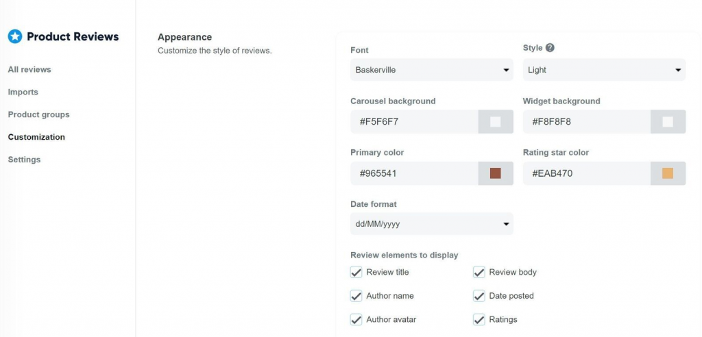
Product reviews customization on ShopBase store
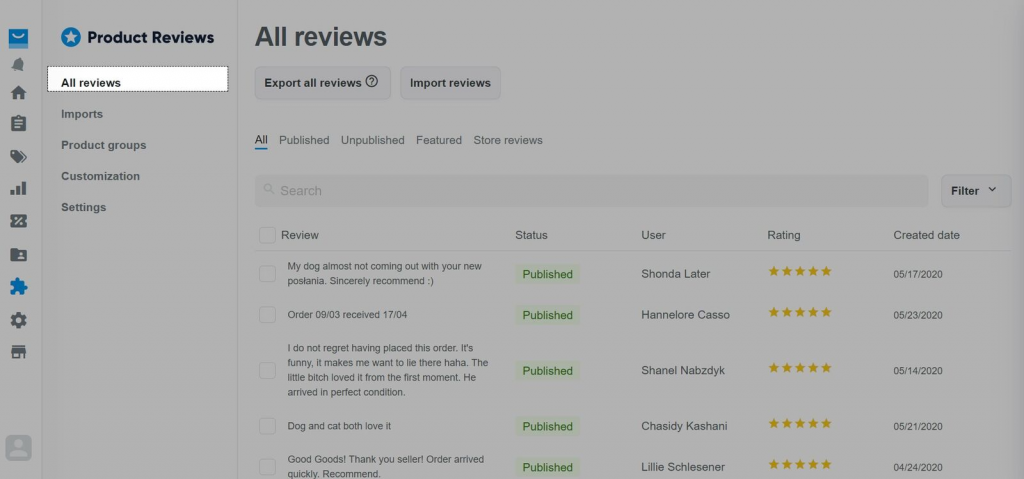
Manage reviews on the Product Review app
- Tighten Return and Exchange Policy
Returns, refunds, and exchanges are all a part of doing business online. Statista estimates return deliveries in the U.S will cost businesses $550 billion by 2020—a 75.2% increase from four years earlier. Plus, nearly 41% of shoppers buy with the intent of returning.
Customers might be unsatisfied with their order for several reasons—it arrived damaged, they ordered the wrong size, or it simply didn’t meet their expectations. So they ask for a replacement or their money back.
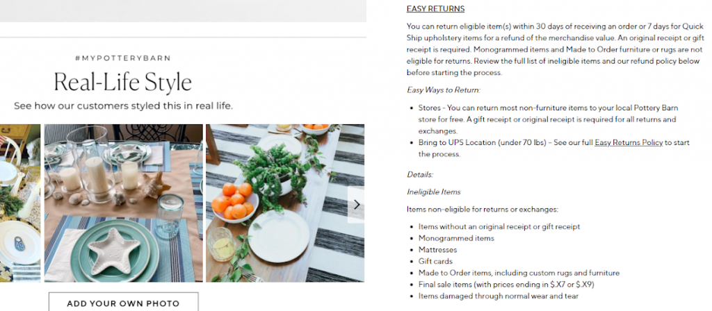 Pottery Barn’s return policy is right on the product page
Policies will vary depending on the logistics of your eCommerce business and the products you sell, but every policy should cover the following basics:
-
- What items can be returned and/or exchanged
- What products are non-returnable and/or non-exchangeable
- When things can be returned or exchanged (i.e.. 30, 60, or 90 days past purchase date)
- In what condition can items be returned (i.e., lightly worn, with tags still on, original packaging, original condition, etc.)
- What products can be returned for (i.e., store credit, refund, a product of equal value, etc.)
- How to initiate a return or exchange (i.e., an email address to contact or a web page to visit)
- Showcase Your Site Security
While it’s nice for your customers to connect to your brand on an emotional level, they still need to be confident that their personal details and payment information are safe when they shop with you. 20% of online shoppers in the US have abandoned an order due to security concerns, meaning you could be missing out on revenue from one in every five customers if you don’t make your security protocols front and center.
By using “trust signals” across your website and checkout, you can boost customer confidence and increase sales. Trust signals include:
-
- An SSL certificate. This certification shows visitors that your website is secure and encrypted by prompting your browser to show a padlock logo in the address bar when you visit certain sites.
- Recognizable security badges, such as from McAfee or GeoTrust. Over 75% of customers said they didn’t buy because they didn’t recognize the trust logos used.
- Recognizable express payment options. These trusted payment options not only add convenience but can also alleviate security concerns by only requiring login info rather than credit card details.
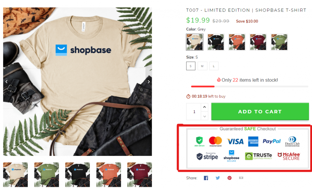
On ShopBase, we offer trust badges that are from the organizations that are easily recognized and appreciated such as Paypal, MasterCard, or Visa
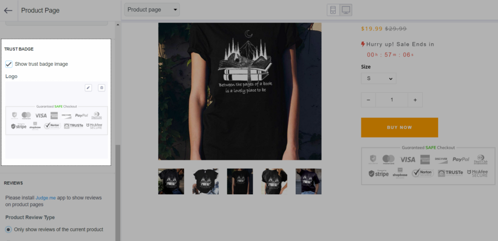 ShopBase has the option to display trust badges on the product page and checkout page for all current themes
Build your reliable online business with ShopBase today
Prioritize Mobile Conversion
Today, internet users worldwide not only prefer accessing websites from a mobile device rather than a desktop, but they are also doing so with more eCommerce intent than ever. In fact, it’s expected to grow 68% by 2022. And consumers expect mobile experiences that rival those on desktops.
However, mobile conversion is not a piece of cake. What ends up winning for desktop audiences, often does not for mobile users. A common scenario is when online shoppers do their research (read product reviews, compare prices, find alternatives…) on mobiles but switch to close the deal on desktops. There can be two explanations for this:
- The characteristics of mobile devices: Mobile screen size isn’t optimal for shopping as it can hardly provide website visitors with enough information that will support the buying decision. Or, network speed makes the browsing experience uncomfortably slow.
- Subtle usability mistakes that companies make: Companies often strip down the mobile shopping experience to the basics by compressing the whole process into a minimizing number of taps. Of course, once someone decides what to buy, they should be able to do it with a minimal number of taps. But if someone is undecided, they should feel free to explore and compare.
Making mobile conversions a priority for your eCommerce store means you won’t miss out on this valuable group of potential customers.
To boost your mobile conversion rate, make sure your products can be not only viewed but also purchased on a mobile device. Let’s start with:
- Reduce the number of checkout steps required by, for example, using a progress bar to show visitors how they are progressing through the checkout process, and implementing guest checkout so users don’t have to create an account.
- Resize your images to 1-2MB maximum and save them as a PNG instead of a JPEG;
- Use standard font size for body copy on mobile devices, which is 16px;
- Shorten your headlines by six words or less;
- Only have one call-to-action per page.
Pro tips: To get a sense of how your mobile site is performing, use Google’s Page Speed Insights tool. It will show you how both your mobile and desktop sites are performing, as well as provide recommendations for improvements.
Bottom Line
Your customers are going to learn about your product in different ways. Some will be moved by your promotions while others will appreciate the specifications listed in your product descriptions. All in all, the more knowledgeable your customers feel about your products, the more likely they are to trust you and buy from you. Once your product page is optimized, sales will come in no time.
With ShopBase, product page optimization can’t be easier.
As we understand the struggle you’ve been through, we created Store Builder – the all-in-one powerful feature that you can only find when using ShopBase. On the product page, you just need to fill the store with the products you want to sell, add detailed descriptions to your items, and your store is all set!
Take a look at the demo product page that we’ll create for you:
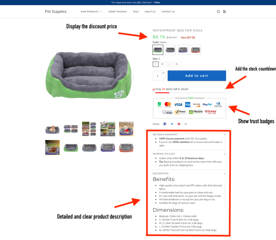
Here, every element has been optimized to its best:
- Display the discount price next to the original price to increase the purchasing rate;
- Place the countdown timer or the stock countdown to drive the scarcity instinct;
- Highlight the “Add to cart” button with bright colors like red, green, etc;
- Write detailed and clear product descriptions.
Now that you know the basics of product page fundamentals, it’s time to take YOUR product page to the next level.
Start creating your online store with ShopBase’s fully-featured and optimized templates for free!
More proven techniques and case studies for you to explore:
- 19 must-know eCommerce trends to win big in the second half of 2021
- Part-time Dropshipper Reached $100k Monthly Revenue in 1 Year with 1 Process: How and How?
- Shoot up your revenue by 4.5 times with Upselling and Cross-selling strategies
- How to Grow Your Ecommerce Business Using Personalized Content?